
We build websites like magazines: every page is a chapter, every element is typeset for narrative flow.
Framaro is a web design studio based in El Poblado, Medellín. We treat digital presence as an editorial practice—thoughtful, structured, and deeply collaborative. No templates, no dashboards. Just bespoke work built from first principles.
Start a dialogue →
El Poblado, Medellín — 2026
Curated from the Archive
A focused look at recent projects, emphasizing editorial clarity over clutter. Each represents a distinct narrative challenge.
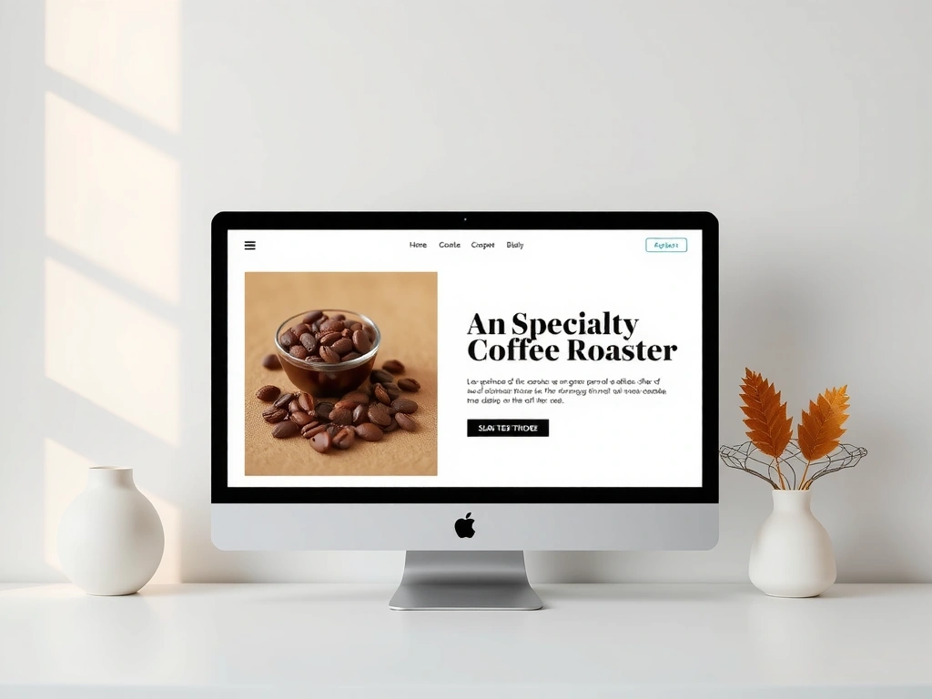
Café de la Luz
Digital menu and story platform. Micro-interactions guide selection without noise.
View Case →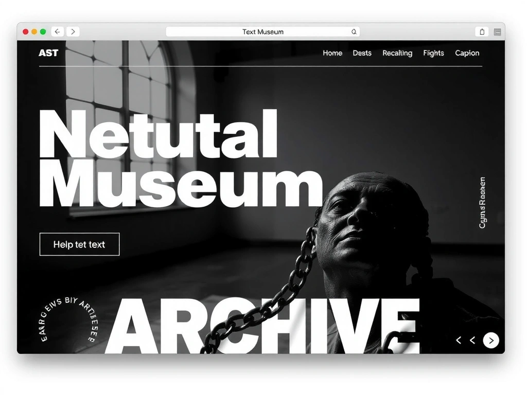
Museo de la Memoria
Digital companion for historical archive. Accessibility and contemplative navigation.
View Case →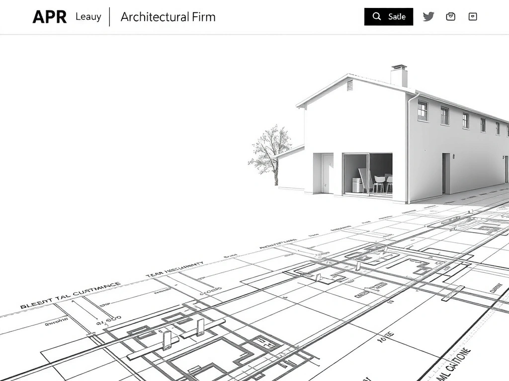
Arquitectura Viva
Portfolio for sustainable architecture. Grid mimics structural blueprints.
View Case →The 'Material Logbook' Entry: Rebuilding a Narrative
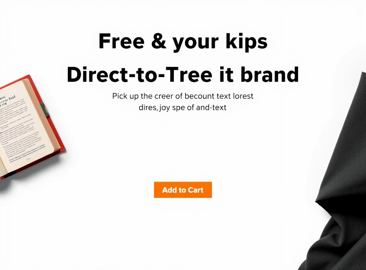
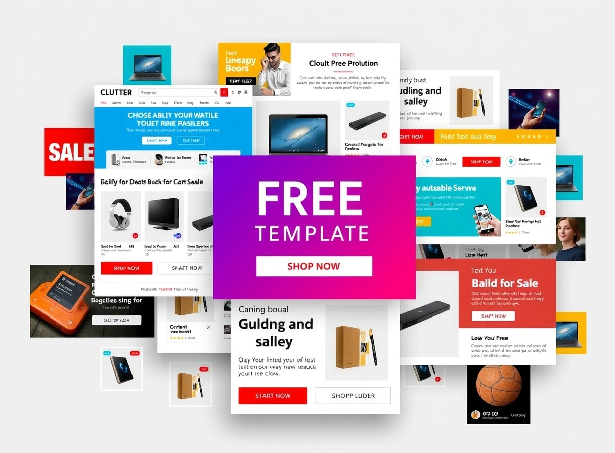
Before: a templated, cluttered eCommerce site. After: a focused editorial experience. A single toggle reveals the transformation.
Terms We Actually Use (And Why They Matter)
- Editorial Layout
- Not just columns. It's the conscious arrangement of text, image, and whitespace to guide the reader's eye through a narrative hierarchy. Why we insist on it: It forces us to prioritize information and eliminate decorative noise.
- Semantic HTML
- Code that describes content, not just positions it. We use proper tags (
header,article) for clarity. Why we insist on it: It’s the foundation for accessibility and long-term maintenance. - Tactile Interface
- UI that feels physical, using soft shadows, rounded corners, and subtle hover feedback. It feels like a well-loved notebook, not a sterile app. Why we insist on it: It creates a human connection in a digital space.
- Performance Budget
- A non-negotiable limit on page weight and JavaScript execution. We audit every third-party script. Why we insist on it: Speed is part of the user experience, not an afterthought.
Common Traps & How We Avoid Them
- → The Template Gravity: Defaulting to a 'hero section + features' pattern. Our move: We start with content hierarchy, not page components.
- → The JavaScript Crutch: Using React for static content. Our move: We ask: 'Does this need state management?' If not, we use vanilla JS or semantic HTML.
- → The Vanity Metric: Chasing 'time on site' with autoplay video. Our move: We measure 'task completion' and 'ease of discovery'.
- → The Dark Pattern: Hiding key info behind 'Read More' or complex filters. Our move: We front-load critical information with clear scannability.
Method Note: We evaluate robustness by stress-testing our own designs. Can a screen reader navigate it intuitively? Does the core message survive on a slow connection? Does the layout hold up at 200% zoom? We fix what breaks these tests first.
The Material Logbook
Our thinking process, documented in raw notes, sketches, and iterations. Not a polished case study—a snapshot of the work.
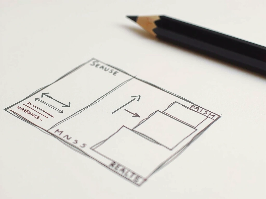
Pen & Paper. Initial wireframe for 'Museo de la Memoria' archive. Client requested 'emotional but not heavy'. We sketched three interaction models. Chose the one that felt like turning pages in a book.
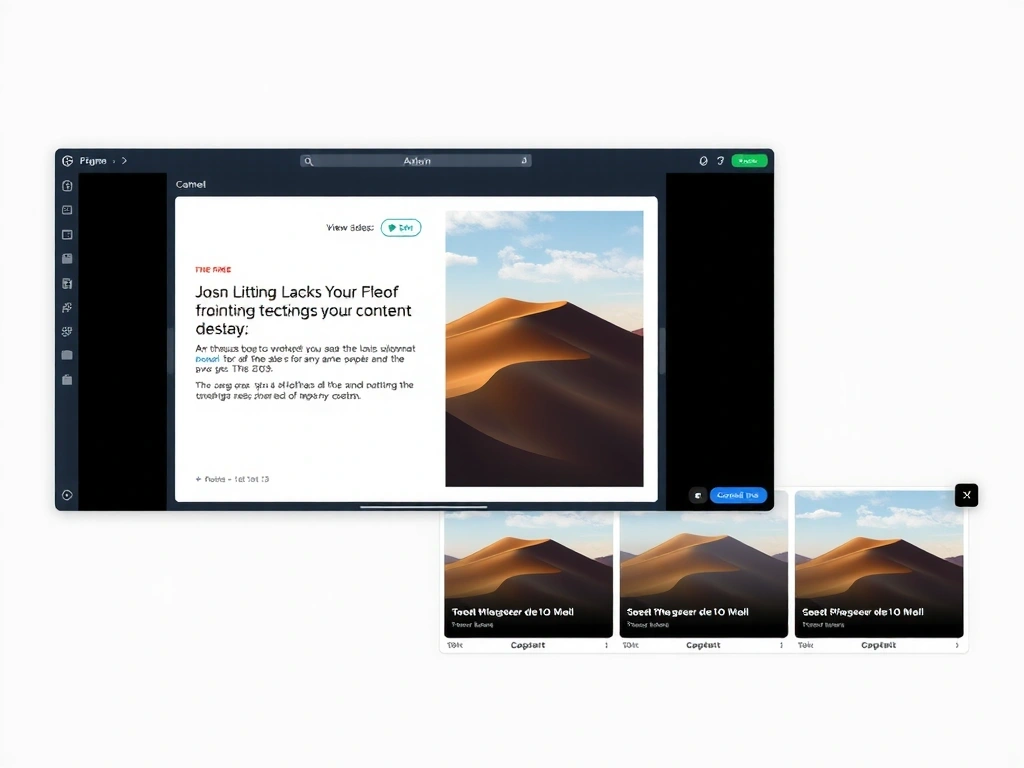
Figma Artboard. From sketch to vector. We maintained the 'book' metaphor but added a subtle parallax scroll. The 'sticky caption rail' was born here—keeping context visible while reading deep archives.
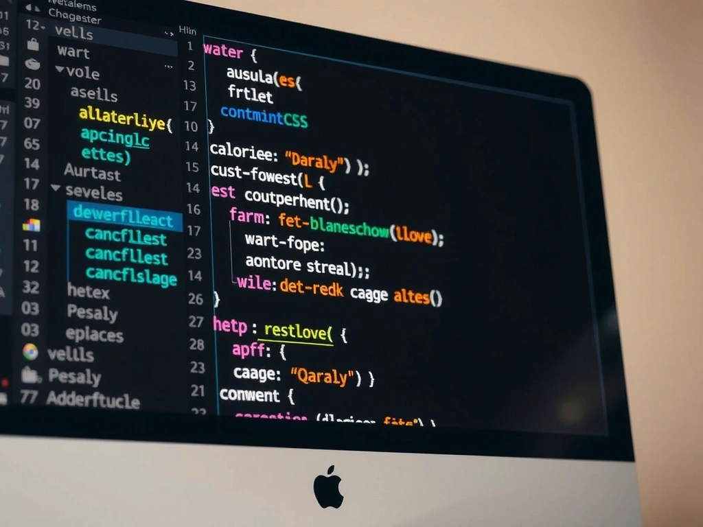
VS Code. Hand-coding the 'Arquitectura Viva' grid. No frameworks. A custom CSS grid that mimics blueprint lines. The client’s main requirement: 'Show the structure.' We did.
Start the Conversation
We begin with a 30-minute video call to understand your vision, constraints, and goals. Please share your current site and 2–3 examples of digital experiences you admire.
Studio Details
Calle 2 Sur #33-29
Medellín, Colombia
Mon – Fri: 9:00 – 18:00
Medellín Time (COT)
We typically respond within 2 business days. For urgent inquiries, please include 'Urgent' in the subject line.